At the beginning of the year I ran a painting challenge for myself, Cardboard Fortress and Chris, where we all had a box of three mini's, each of which was guaranteed to have the same mini inside it.
The aim of this was for us all to paint the same model and then we could look at the different painting styles we all chose to use, and complete a group project together.
This is the second running of this type of challenge and I've managed to get a couple more participants this time.
The mini in question this time was the Pin-Up Sergeant by Across the Realms and we took advantage of Duncan's 3D printer to get a bunch printed, then I just had to mail them out to folks who said they were interested in taking part.
My own undercoated version is rather fuzzily pictured here:

I chose to add a couple of sandbags to the base to add interest, added some sand for ground cover and then primed the lot with white.
I started to think about possible themes to paint her and was eyeing my Catachan shelf in my display cabinet with a thought to have her match them.
Inspiration hit thought when a trailer for Street Fighter 6 popped up on the switch as I was waiting for Legend of Zelda to finish updating.
Cammy was a particular favourite character and the mini does look a bit like her:

No, not from the damned awful movie...the game version you dolt, although i can look at Kylie Minogue in that outfit all day.
Now as time went on, she had several different costumes, but the two which most stand out are NATO Cammy with the classic Green and Red:


Seeing as I was aiming for her to match somewhat with the Catachan's, I went with the classic NATO Cammy scheme with the green and red combo.
Now the miniature has a lot more armour plates on her then the Street Fighter character, so I chose to paint all of those red, her "fatigues" are painting in the greens unused for the Catachan's, then just picked out weapons with black and silver.
She gained one spot of gold for her cap badge, and her blonde hair and pale skin tone finished her off:
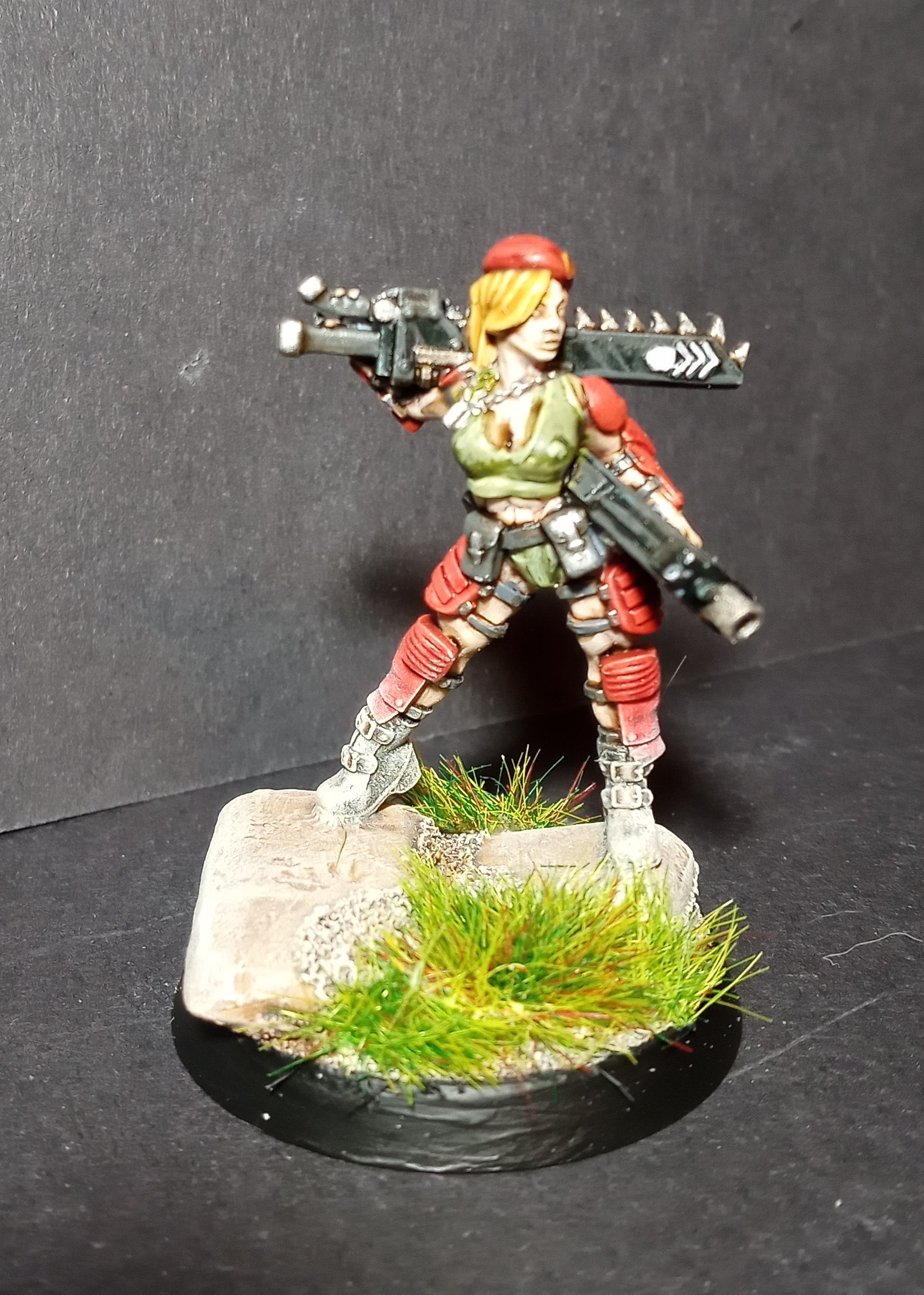


Grass tufts around the sandbags and painting the base rim black were all that was left to finish the model entirely.
I think she's come out rather well personally, and she definitely matches the character art I was working with as a reference, perhaps a little too much red in hindsight, but it works.
Onto other people's efforts now, and first up we have Cardboard Fortress:

The red fatigues contrasted with the blue weapons makes her certainly stand out.
I like how we had the same idea to paint the armour plates in a different colour entirely, dark grey in this case.
(I must ask him for his recipe of blonde hair, as this one looks good).

With a dark subdued colour scheme, the bright spot being her pink hair.
I know Duncan is a big fan of 2000AD, so could she be Tank Girl inspired?
The banner is taken from some other 3D prints he did for me and this was a misprint, where the tear is. It certainly adds a different take on the miniature which neither myself nor Cardboard Fortress used which makes this mini unique and one of the reasons why I organise this paint challenge.
We have DaemonForge next:

He's gone for a darker skin tone which is a nice change and the dark fatigues and armour contrast well with the desert base.
I do like the classic GW throwback with the hazard stripes on the chainsword, love the effort there.
And finally we have Chris's effort:

Chris's miniature is quite close to my own however he's used a Magenta paint for the armour (which he was mentioning he recently bought and wanted to use).
Like DaemonForge he's also used a darker skin tone and gone for full pant fatigues.
So there is everyone's efforts with this free STL, again it's been nice to compare and contrast everyone's different painting style, for example compare the two skin schemes between mine and Cardboard Fortress.
I stippled lighter skin colours over a base of Guilliman Flesh contrast, whereas his looks like a classic lining technique over a shadowed base colour (I may be wrong on this, he'll correct me in the comments I'm sure).
I also find it interesting the different scales of colour shades we used, mine and Fortress are quite bright, Duncan and Forge are very dark and moody when compared against ours, and Chris' mini uses his usual desatured palette.
No doubt we'll do this again, maybe next summer or maybe a bit later in the year.
Until next time, have nice day...
No comments:
Post a Comment